The anatomy of everyday UI: color and light
Color and light provide personality, depth, and tactility to interfaces. With multiple color spaces, powerful gradient and composition filter functions, element shadows, and inter-color interactions, the possibilities for color on the web are now endless.
Color spaces and gamuts
Browsers today support many different color spaces and gamuts including Display P3, ProPhoto, XYZ, and OKLAB and OKLCH. Some of these include their own special CSS functions, while others use the newer color() function. Color gamuts and spaces are slightly conflated as names like Display P3 can refer to both the available spectrum of colors, while also (in CSS) be used as space for determining what value is outputted.1.
Hexadecimal
Hexadecimal (hex) colors are an alternative way to represent sRGB (standard red, green, and blue) colors using base-16 (0-9A-F) channels for red, green, and blue.2 One of the better known color formats, channels can include one or two values, with the value being duplicated when only 1 is present. Values are also case insensitive:
/* syntax options */
color: #f0a;
color: #F0A;
color: #F0a;
color: #ff00aa;
color: #FF00AA;
color: #FF00aa;
The first channel is represents red, the second channel green, and the third channel blue. Alpha (opacity) values can also be added to the end as a fourth channel, with the 0-255 being converted as a 0%-100% alpha value:
color: #000000FF; /* black 100% */
RGB
The rgb() function accepts values for red, green, blue, and an alpha value and can display any color in the sRGB color gamut.3 Red, green, and blue can be represented as values from none, a number between 0-255 or a percentage between 0%-100%. The alpha channel can be represented as a number between 0-1 or a percentage between 0%-100%. Color channel values cannot be mixed between numbers and percentages, but none and either alpha syntax is valid in both contexts.
In the past, values were comma separated, and (if an alpha value was included), the rgba() function was used instead. Now, things are much more simple. Values are separated by spaces, alpha is added as / [alpha] and rgba() function has been essentially deprecated.
/* syntax options */
color: rgb(100% 0% 0% / 1);
color: rgb(100% 0% 0% / 100%);
color: rgb(100% 0% none / 1);
color: rgb(255 0 0 / .1);
color: rgb(255 0 0 / 100%);
color: rgb(255 0 none / 1);

/* older syntax */
color: rgb(255, 0, 0);

/* deprecated */
color: rgba(255, 0, 0, .5);

/* invalid, can't mix percentages and numbers for color channels */
color: rgb(255 100% 50);
HSL
The hsl() function accepts values for hue, saturation, light, and an alpha value and can display any color in the sRGB color gamut.4 Hue is represented as a number, angle, or none (a number value represents an angle value in degrees). Angles in CSS can be represented as deg, grad, rad, and turn.5 Saturation and light are represented as percentages 0%-100% or none, which is equal to 0%. Finally, the alpha channel can be represented as a number between 0-1 or a percentage between 0%-100%, just like RGB.
Like rgb(), values were comma separated in the past–with alpha changed by using the hsla() function. And just like rgb(), this syntax has been replaced with space delimited values and an optional / [alpha].
/* syntax options */
color: hsl(120deg 100% 50%);
color: hsl(120deg 100% 50% / 1);
color: hsl(120deg 100% 50% / 100%);
color: hsl(.3turn 100% 50%);
color: hsl(2.1rad 100% 50%);
color: hsl(133grad 100% 50%);

/* older syntax */
color: hsl(120deg, 100%, 50%);

/* deprecated */
color: hsla(120deg, 100%, 50%, 1);
While HSL is displayed in in the sRGB color gamut, defining values with hsl() is much more human friendly than rgb(). Each color is represented as 0-360° degrees on the color wheel, and light and saturation can then be used to darken and desaturate values. This means you can find complementary colors by changing just the hue color channel.
HWB
The hwb() function accepts values for hue, whiteness, blackness, and an alpha value and can display any color in the sRGB color gamut.6 Like HSL, hue is represented as a number, angle or none. In addition, the alpha channel can be represented as a number between 0-1 or a percentage between 0%-100%, just like RGB and HSL.
With HWB, the second and third channel can affect each other. If you set both the white and black channels to 0% for a color, you will get bright, vibrant colors. Change them to anything that adds up to 100% however, and you’ll get straight grey. An easy way to get a sense for HWB is to increase the white and black channels independently of each other. Increase white and colors will get lighter and more pastel. Increase black and they will get darker and more muted. Set either to 100% and you’ll get raw white or black respectively.
Where HSL is great for finding complementary colors at the same lightness and saturation, HWB is great for creating darker and lighter versions of the same color.
/* syntax options */
color: hwb(120deg 10% 0%);
color: hwb(120deg 10% 0% / 1);
color: hwb(120deg 10% 0% / 100%);
color: hwb(.3turn 100% 50%);
color: hwb(2.1rad 100% 50%);
color: hwb(133grad 100% 50%);
LAB
The lab() function accepts values for lightness, a red-green axis (A), a blue-yellow axis (B), and an alpha value, and can display any color in the CIE color gamut.7. Lightness is represented as a number between 0-100, a percentage between 0%-100% or none. The red-green axis is a number between -125-125 or a percentage between -100%-100%, where negative values are more green, and positive values are more red. The blue-yellow axis (B) is a number between -125-125 or a percentage between -100%-100% where negative values are more yellow, and positive values are more blue.8 Finally, the alpha channel can be represented as a number between 0-1 or a percentage between 0%-100%.
/* syntax options */
color: lab(100, -125, 125);
color: lab(100, -125, 125 / 1);
color: lab(100, -125, 125 / 100%);
OKLAB
The oklab() function accepts similar values to the lab() function and can display any color in the corrective CIE color gamut.9. The major difference between the oklab() and lab() function’s syntax is the A and B channel’s numerical values are between -0.4–0.4.
/* syntax options */
color: oklab(0, -0.4, -0.4);
color: oklab(1, 0.4, 0.4);
color: oklab(0%, -100%, -100%);
color: oklab(100%, 100%, 100%);
color: oklab(100%, 100%, 100% / 1);
LCH
The lch() function accepts values for lightness, chroma, hue, and an alpha value and can display any color in the CIE color gamut.10. Lightness is represented as a number between 0-100, a percentage between 0%-100% or none. Chroma can be an unbounded positive number 0-n, a percentage between 0%-100%, or none. In this case, 100% equals the number 150. Like HSL and HWB, hue is represented as a number, angle or none. Finally, the alpha channel can be represented as a number between 0-1 or a percentage between 0%-100%, just like LAB.
/* syntax options */
color: lch(100, 150, 120deg);
color: lch(100, 100%, 120deg / 1);
color: lch(100, 100%, 120deg / 100%);
color: lch(100, 100%, .3turn);
color: lch(100, 100%, 2.1rad);
color: lch(100, 100%, 133grad);
OKLCH
The oklch() function accepts similar values to the lch() function and can display any color in the corrective CIE gamut.11 The major difference between the oklch() and lch() function’s syntax is the Chroma channel’s numerical upper perceivable value is 0.5.
/* syntax options */
color: lch(100, 0.5, 120deg);
color: lch(100, 100%, 120deg / 1);
color: lch(100, 100%, 120deg / 100%);
color: lch(100, 100%, .3turn);
color: lch(100, 100%, 2.1rad);
color: lch(100, 100%, 133grad);
Other color spaces
Many other color spaces can be rendered using the color() function, which can display colors in any color space that supports specifing values in red, green, and blue channels.12 First, a color space value like display-p3 is specified, followed by red, green, and blue channel values represented as a number between 0–1 or a percentage between 0%–100%, and finally an optional alpha channel represented as a number between 0-1 or a percentage between 0%-100%. Unlike other color functions, numbers and percentage values for red, green, and blue can be mixed and matched.
/* available color spaces and syntax */
color: color(srgb 1 0 0 / 1);
color: color(srgb-linear 1 0 0 / 1);
color: color(display-p3 1 0 0 / 1);
color: color(prophoto-rgb 1 0 0 / 1);
color: color(rec2020 1 0 0 / 1);
color: color(xyz 1 0 0 / 1);
color: color(xyz-d50 1 0 0 / 1);
color: color(xyz-d65 1 0 0 / 1);
The color() function supports the list of spaces listed above, but importantly does not support HSL, HWB, LAB, LCH, OKLAB, or OKLCH.
sRGB and sRGB Linear
The srgb color space renders colors in the same way as the rgb() function and is limited to the same range of colors in the sRGB color gamut.
The srgb-linear color space is also limited to the same range of colors in the sRGB color gamut, but are not gamma corrected in their output. This is a nuanced issue most developers won’t need to worry about, but basically sRGB applies gamma correction to colors to keep them consistent between viewing devices. This is preferred when rendering colors directly as backgrounds, text, etc. but a pain when applying light shading to a 3D object. Unity has documentation on gamma versus linear color applications with some examples of why linear can be beneficial (this information doesn’t necessarily apply to web development, but has great examples of linear vs gamma corrected outputs).
Wider gamut spaces
The display-p3 color space renders all colors available in the Display P3 color gamut, which supports about 50% more supports colors than sRGB.13
The rec2020 color space renders all colors available in the Rec2020 color gamut and supports about 37% more colors than Display P3.14 However, display support is much smaller for Rec2020 versus Display P3 at the time of this writing.
Both of these spaces (along with srgb) can be safely utilized with fallbacks, by checking the color-gamut media query15:
@media (color-gamut: srgb) {
  /* safe to use srgb colors */
}

@media (color-gamut: p3) {
  /* safe to use p3 colors */
}

@media (color-gamut: rec2020) {
  /* safe to use rec2020 colors */
}
In addition, support for other color spaces like xyz can be checked with the @supports query:
@supports (background: color(xyz 0 0 0)) {
  /* safe to use xyz colors */
}
Polar color spaces and hue interpolation
Polar color spaces (hsl, hwb, lch, and oklch) can define hue interpolation values of shorter hue, decreasing hue, longer hue, and increasing hue in certain contexts. Relevant sections of this article will reference back to this section, explaining how this works.
Hue interpolation indicates how two colors should interpolated around a color wheel. This is supported in the color-mix(), linear-gradient(), radial-gradient() and conic-gradient() CSS functions.
/* syntax */
/* in <polar-color-space> <hue-interpolation-method> */

/* examples using the color-mix function */
color-mix(in hsl shorter hue, blue, red);
color-mix(in hwb longer hue, blue, red);
color-mix(in lch decreasing hue, blue, red);
color-mix(in oklch increasing hue, blue, red);

/* examples using the linear-gradient function */
linear-gradient(to right in hsl shorter hue, blue, red);
linear-gradient(to left in hwb longer hue, blue, red);
linear-gradient(90deg in lch decreasing hue, blue, red);
linear-gradient(180deg in oklch increasing hue, blue, red);
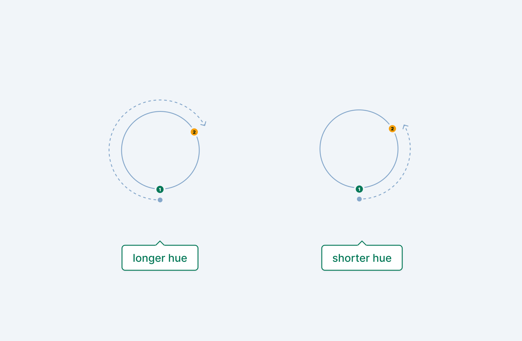
Short and long hues
Short and long hue calculations take the polar space color value’s angle on the color wheel and finds the shortest or longest route, either in a clockwise or counter-clockwise direction.16
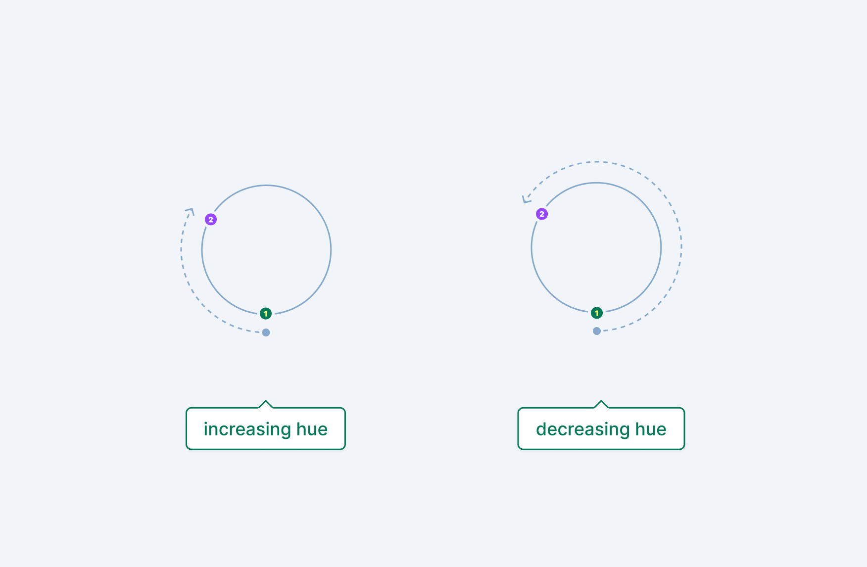
Increasing and decreasing hues
Increasing hue calculations always go in a clockwise direction, while decreasing hue calculations always go in a counter-clockwise direction. This means both can mix colors using more or less of the color wheel, depending on the first and second color’s angle values.17
System colors
CSS includes many system colors, which inherit from the operating system and browser, along with keywords like currentcolor, which inherit from colors defined on the current element or its ancestors.
Current color
The currentcolor keyword uses the value applied to the CSS color property for the currentelement. This includes inherited color values, and can be used anywhere a valid color type is allowed.18 The currentcolor keyword can also be interpolated, meaning animations applied to color values on ancestor elements will happen on descendants as well.
When applying the color property to an element:
- all descendant element’s text inherits the same color, unless they specify their own value
- the container’s and descendant’s borders also inherit the color, again unless they specify their own value
However, things like background-color do not inherit the color property’s value and setting a value like inherit only applies when the parent container also has a specified background-color. This is where currentcolor can be powerful, especially when working with SVG elements.
Applying currentcolor to the fill and stroke attributes of SVG elements like <path> will ensure the value matches the closest applied color value, even if that means using the default color applied to the entire document. This can be a very powerful tool when managing an SVG icon library in component systems: use currentcolor for fills and strokes, inherit colors everywhere and–when needed–explicitly set the color using a wrapper element.
System colors
System colors include various keywords to apply colors based on default document colors such as backgrounds, text, active colors, etc. As with currentcolor, system color values can be used anywhere a valid color type is allowed.19 Importantly, these keywords are not using values you applied to the <html> or <body> elements, but rather static values based on the browser, operating system, and user agent overrides.
Some examples of system colors include the static document background color Canvas and the static document text color CanvasText. What makes these values really interesting, is that you can utilize them to auto apply dark mode values that match your system and browser. In order to do so, you’ll need to add a color-scheme value to the root of your document, noting that both light and dark schemes are supported.20
:root {
  color-scheme: light dark;
}
You can also assign color-scheme to just light or dark to force a specific mode and still use system colors with the correct value. What’s more, you can apply the value to any element, not just :root! If you’re trying to force a specific color scheme, it’s recommended that you add the only keyword in front to strongly suggest to browsers that the document can only support one color scheme.21
Gradients
Gradients created in CSS are considered image types, which impacts where they can be applied. You can’t assign a gradient to the color or background-color properties, but you can apply them to properties that support the image type, including background, background-image, and list-style-image.22
Linear gradients
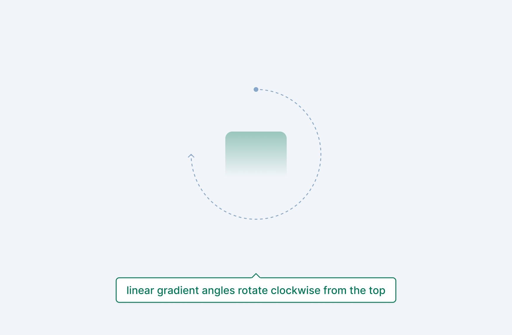
The linear-gradient() CSS function renders a color gradient on a straight line. The first value is the angle direction–starting from the center, going clockwise–which defaults to 0deg. The angle can be formatted as any valid angle type. You can also use natural language values, which are translated to an angle during render time:
| natural language value | angle |
|---|---|
| to top | 0deg |
| to right | 90deg |
| to bottom | 180deg |
| to left | 270deg |
/* syntax options for direction */
background: linear-gradient(90deg,    /* color stops */);
background: linear-gradient(.25turn,  /* color stops */);
background: linear-gradient(0.5rad,   /* color stops */);
background: linear-gradient(100grad,  /* color stops */);
background: linear-gradient(to right, /* color stops */);
Note: natural language values include corner values such as to top right , but be aware: this isn’t calculated directly as 45deg.
Color stops and hints
After the direction comes a series of color stops and hints. At least two stops are required, but you can have as many as you like. Color stops include a color value and an optional percentage or static length denoting how much of the gradient should include just that color:
/* syntax options for color stops */
background: linear-gradient(/* gradient direction */, red, blue);
background: linear-gradient(/* gradient direction */, red 0%, blue 100%);
background: linear-gradient(/* gradient direction */, red, green, blue);
background: linear-gradient(/* gradient direction */, red 0%, green 50%, blue 100%);
Color hints are a percentage or static length and are used to interpolate the progression of the gradient between the previous and next color stop. They are also calculated from the entire gradient progression, so setting 100% as a hint after a color stop will only show that color for the rest of the gradient.
/* syntax options for color hints */
background: linear-gradient(/* gradient direction */, red, 25%, green, 75%, blue);
background: linear-gradient(/* gradient direction */, red 0%, 25%, green 50%, 75%, blue 100%);
Radial gradients
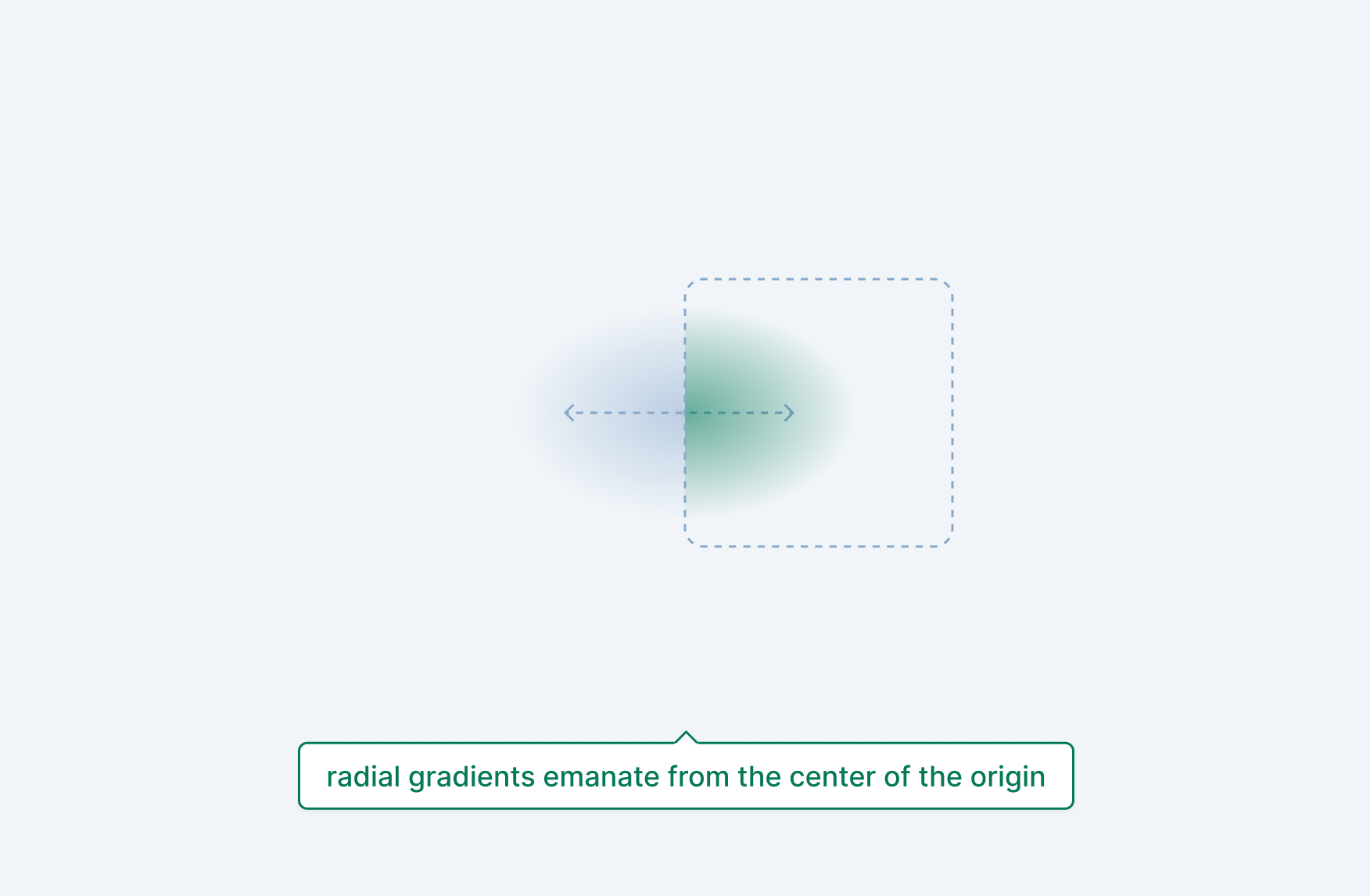
The radial-gradient() CSS function includes the same color stop and hint values as linear-gradient() but with different starting values. Because all radial gradients originate from a center, there is no angle value. Instead, shape, size, and position values can be provided. Each value includes a default and can be omitted, but when used together, the order should be:
background: radial-gradient(<shape> <size> <position>, /* color stops */);
Shape
A radial gradient’s shape can be denoted as a circle or an ellipse, which is the default.23 An ellipse is based on the container’s dimensions, while a circle has a 1:1 aspect ratio.
/* syntax options for shape */
background: radial-gradient(ellipse, /* color stops */);
background: radial-gradient(circle, /* color stops */);
Size
A radial gradient’s size can be defined based on its container’s edges or as an explicit size. Valid edge values are closest-side, closest-corner, farthest-side, and farthest-corner (the default value). Valid explicit size values depend on the shape. For circle shapes, percentages are not allowed as it’s unknown which axis should control the percentage. For ellipse shapes, static lengths or percentages are allowed, but both the x and y axis values need to be defined. Both shape’s size value translates to a radius, not the full size end to end:
/* syntax options for size and ellipse shape */
background: radial-gradient(ellipse closest-side,    /* color stops */);
background: radial-gradient(ellipse closest-corner,  /* color stops */);
background: radial-gradient(ellipse farthest-side,   /* color stops */);
background: radial-gradient(ellipse farthest-corner, /* color stops */);
background: radial-gradient(ellipse 100% 50%,        /* color stops */);
background: radial-gradient(ellipse 100px 50px,      /* color stops */);

/* syntax options for size and circle shape */
background: radial-gradient(circle closest-side,    /* color stops */);
background: radial-gradient(circle closest-corner,  /* color stops */);
background: radial-gradient(circle farthest-side,   /* color stops */);
background: radial-gradient(circle farthest-corner, /* color stops */);
background: radial-gradient(circle 30px,            /* color stops */);
Position
A radial gradient’s position position value conforms to position type and defaults to center, but be aware that more complex options like offsetting from a side (e.g. right -1rem) are not supported. Also make sure to include the at keyword beforehand, even if omitting the shape and size values:
/* syntax options for position */
background: radial-gradient(at center,       /* color stops */);
background: radial-gradient(at 50%,          /* color stops */);
background: radial-gradient(at 50% 50%,      /* color stops */);
background: radial-gradient(at right center, /* color stops */);
background: radial-gradient(at 100% 50%,     /* color stops */);
background: radial-gradient(at bottom right, /* color stops */);
background: radial-gradient(at 100% 100%,    /* color stops */);
Putting these all together, you can control the exact shape, size, and position of any radial gradient:
/* example of all three values */
background: radial-gradient(ellipse closest-side at right center, /* color stops */);
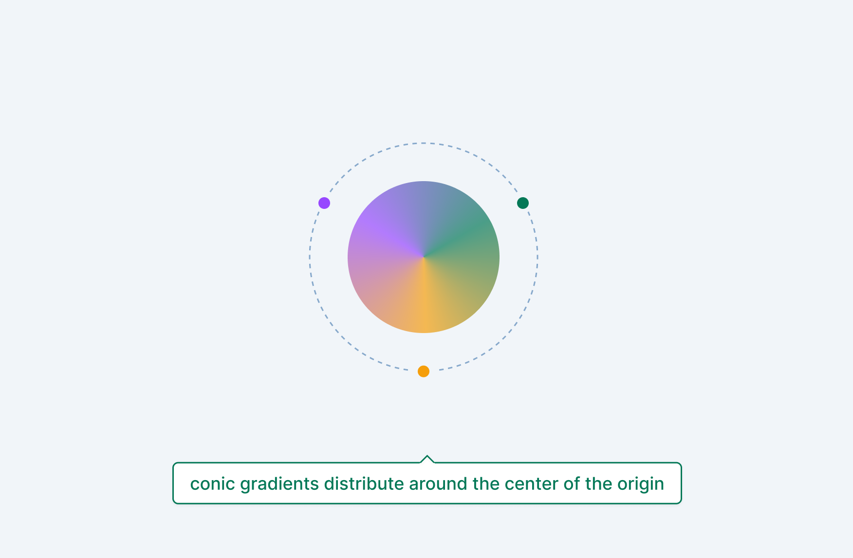
Conic gradients
The conic-gradient() CSS function includes similar color stop and hint values as linear-gradient() and radial-gradient() but with different starting values. Because all conic gradients rotate around a center point, angle and position values can be used as the first parameter in the function.
Just like angles in the linear-gradient() function, any valid angle type can be used. Just make sure to include the from keyword beforehand. The position value conforms to position type and defaults to center, but be aware that more complex options like offsetting from a side (e.g. right -1rem) are not supported. Also make sure to include the at keyword beforehand, even if omitting the shape and size values.
/* syntax options for angle and position */
background: conic-gradient(from <angle>,               /* color stops */);
background: conic-gradient(at <position>,              /* color stops */);
background: conic-gradient(from <angle> at <position>, /* color stops */);
Color stops
Color stops in conic gradients are slightly different than color stops in linear and radial gradients, and are considered angular color stops24. Because a conic gradient rotates around a center origin point and back to itself, it takes up 360deg. Each color stop can include any valid angle type or percentage to denote how much of the gradient it takes up.
/* syntax options for angle color stops */
background: conic-gradient(/* angle and position */, red 180deg, blue);
background: conic-gradient(/* angle and position */, red 50%, blue);
Repeating gradients
There are a two ways to repeat gradients, both offering different strengths. The first is to use the repeating-* function variant of each gradient style we went over: repeating-linear-gradient(), repeating-radial-gradient(), and repeating-conic-gradient(). These functions will repeat the gradient syntax until the image area is filled. For example, let’s say you added background with a blue to red linear gradient with a color stop:
background: linear-gradient(to right, blue, red 25%);
This will fill 75% of the background area with red. However, if you used:
background: repeating-linear-gradient(to right, blue, red 25%);
You would see a blue to red gradient repeated 4 times (25% * 4 = 100%). You can do this with radial and conic gradients as well. The tricky part is that, if your initial gradient values fill the image area, nothing will repeat.
For gradient backgrounds that can be repeated if placed next to and below each other, an easier option might be to use background-size, background-position, and background-repeat. Gradients are simply computed images that (when applied as a background) can be controlled with all existing CSS background properties:
background-image: linear-gradient(to right, blue);
background-size: 1rem 1rem;
background-repeat: repeat;
The key thing to note here is that, just like any other time you use background-repeat, you’re creating a tiling effect. The power of repeating-* gradients is that it doesn’t tile the computed gradient, it extends it out until the entire image area is filled:
Repeating gradients are computed images just like non-repeating ones, so you can actually combine both repeating strategies together for some interesting affects:
Multiple gradients
Multiple gradients can be specified in the background property with commas , and are stacked with the first gradient on top. And because gradients are simply <image> types, you can combine gradients with regular background image imports that use the url(./path/to/image) syntax.
Gradients and color spaces
In the previous section, we went over color spaces and how you can pick different ones for outputting colors. You can also do this with gradients, which will impact not just the color stop values, but also the way the color stops are interpolated together. To specify a color space, use the in <colorspace> syntax:
background: linear-gradient(in oklab, red, blue);
background: radial-gradient(in oklab, red, blue);
background: conic-gradient(in oklab, red, blue);
Polar color spaces such as hsl, hwb, lch, and oklch also support all the hue interpolation keywords, indicating how to transition between colors:
/* Example of hue interpolation in polar color spaces */
background: linear-gradient(to right in hsl longer hue, red, blue);
Color mixing
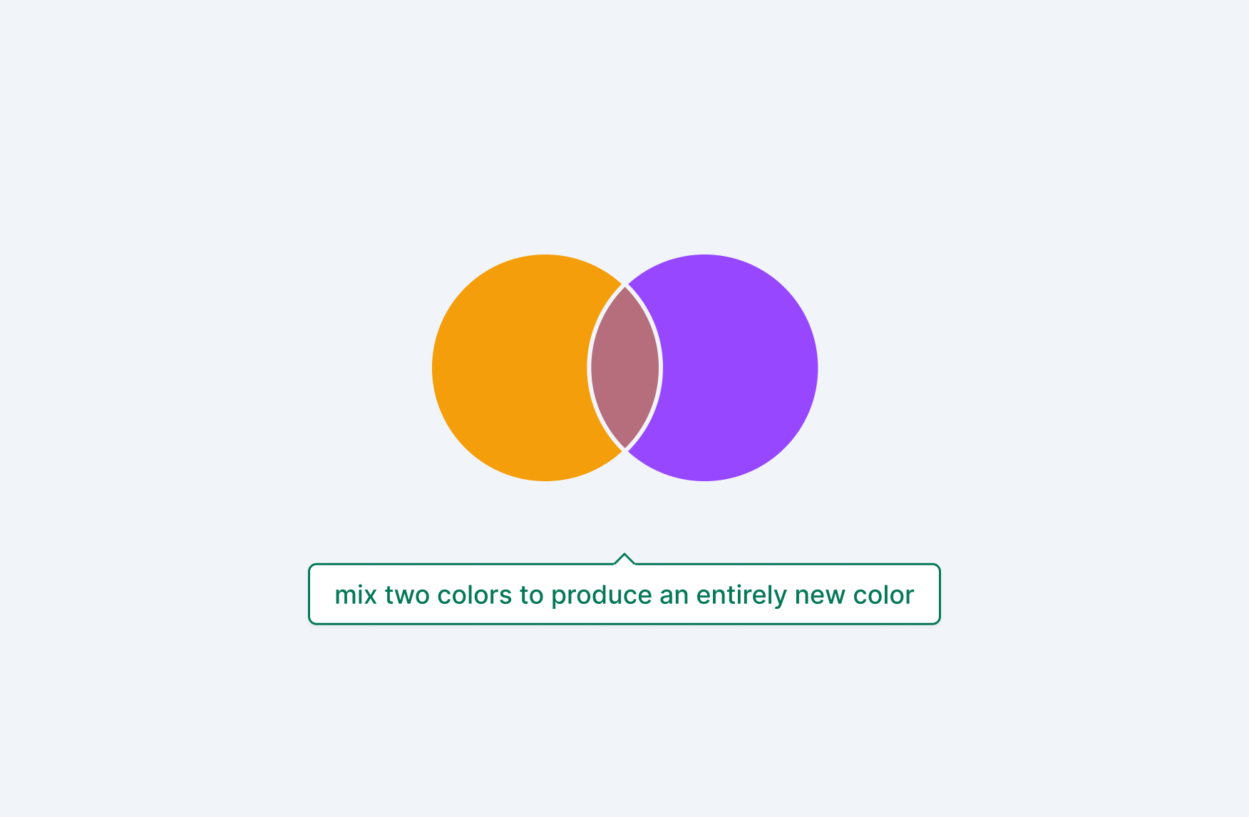
Use the color-mix() function to combine two colors, with varying percentages of each color.25 By default, each color is mixed equally, producing a color mixed with 50% of the first color and 50% of second color.
/* Syntax formatting for the color-mix() function */
color-mix(in <color-space>, <color> <percentage>, <color> <percentage>);
The in <color-space> value refers to the interpolation method mixing will use, as spaces like lch and srgb will mix colors differently. Importantly, the passed in color values can be any valid <color> and do not need to be formatted in the matching color space.
/**
 * Syntax for available color spaces. Passed in
 * colors do not need to match the color space.
 * Because percentages have been omitted, each color
 * is mixed equally, with 50% of both blue and red.
 */
color-mix(in srgb, blue, red);
color-mix(in srgb-linear, blue, red);
color-mix(in lab, blue, red);
color-mix(in oklab, blue, red);
color-mix(in xyz, blue, red);
color-mix(in xyz-d50, blue, red);
color-mix(in xyz-d65, blue, red);
color-mix(in hsl, blue, red);
color-mix(in hwb, blue, red);
color-mix(in lch, blue, red);
color-mix(in oklch, blue, red);
Polar color spaces such as hsl, hwb, lch, and oklch also support all the hue interpolation keywords, indicating how to mix both colors:
/* Example of hue interpolation in polar color spaces */
color-mix(in hsl longer hue, blue, red);
Normalized percentage values
Percentage values are very flexible, as long as they aren’t both 0%. In addition, when combined values are less than or greater than 100%, they are both recomputed by taking each value and dividing by the sum of both. This ensures two values that always add up to 100%.26
For example, if the first color is 70% and the second is 50% , the sum is 120% and the values will be transformed to ~58.3333% and ~41.666% respectively. Or if the values are 30% and 40%, the sum is 70% and the values will be transformed to 42.85% and 57.14% respectively.
/**
 * the following two values are equivalent due
 * to values greater than 100% being converted
 * to always add up to 100%
 */
color-mix(in srgb, blue 70%, red 50%);
color-mix(in srgb, blue 58.3333%, red 41.6666%);

/**
 * the following two values are equivalent due
 * to values less than 100% being converted
 * to always add up to 100%
 */
color-mix(in srgb, red 30%, blue 40%);
color-mix(in srgb, red 42.85%, blue 57.14%);
Transparency
Since any valid <color> type can be passed into the color-mix() function, that includes colors with an alpha value less than 100%. Mixing colors with an alpha channel will produce a color that also has an alpha channel, computed from the two colors (however, it’s not a direct average):
color-mix(in srgb, rgb(0 0 255 / .5), rgb(255 0 0 / .5));
In addition, you can mix a color with the keyword transparent to produce the same color with an alpha channel value computed from the mix percentages:
/**
 * The following comparisons render the same results,
 * but are not necessarily what the browser will
 * directly output in the document.
 */

/* Transparent, without a percentage value */
color: color-mix(in srgb, red, transparent);
color: rgb(255 0 0 / .5);

/* Transparent, with a percentage value */
color: color-mix(in srgb, red 70%, transparent);
color: rgb(255 0 0 / .7);
Note: the transparent keyword does not accept a percentage value.
Shadows
Shadows can be applied flexibly to any box or run of text, indicating depth and (when done consistently) a global lighting source. They can also be applied as inset to create cut-in effects. Coordinates, blur radius, spread radius, color, and the inset keyword can all be used in various combinations.
Box shadows
The box-shadow CSS property creates a shadow around a box element. If the box includes a blur-radius the shadow is rounded. 27
/* Syntax (this order is not necessarily required) */
box-shadow: <inset> <x> <y> <intensity> <spread> <color>;

/* Examples */
box-shadow: 2px 2px blue;
box-shadow: 2px 2px 4px blue;
box-shadow: 2px 2px 4px 1px blue;
box-shadow: 2px 2px 4px 1px blue inset;

/* Alternate inset and color positions */
box-shadow: inset 2px 2px 4px 1px blue;
box-shadow: inset blue 2px 2px 4px 1px;
Length options
When two length values are supplied, they are interpreted as the x and y coordinate offsets. A third length value is interpreted as the blur radius, and a final, fourth length value is interpreted as the spread radius.28
Coordinate offsets
The coordinate offsets (x and y) can be any positive or negative length. A positive x value moves the shadow to the right, while a negative value moves it to the left. A positive y value moves the shadow to the bottom, while a negative value moves it to the top. This means the values don’t exactly map to a cartesian plane, but rather an imaginary global light source in the top left corner of the document.
Blur and spread radius
The blur radius value can be any positive length, where larger values makes the shadow larger but also more spread out, lightening the overall shadow. The spread radius value can be any positive or negative length and will expand or contract the shadow. Setting the blur radius to 0 and the spread radius to any value greater than 1 will create a sharp edged shadow offset.
Inset shadows
Using the inset keyword converts the outer shadow into an inner shadow. All other values are still allowed, but will create a depressed effect instead of an elevated effect:
Multiple shadows
Multiple shadows can be specified with commas , and are stacked with the first shadow on top. If the number of shadows differ between animation states, a default “shadow” with 0 length values and a transparent color are used.
Text shadows
Unlike the box-shadow property, text-shadow creates shadows around text characters.29 While the syntax is similar to box-shadow, inset and spread radius values are not supported (multiple shadows are supported however).
Global lighting source and depth
When creating depth using shadows, its important to keep lighting sources consistent and to use intensity differences to denote layers. All shadows should use either positive or negative coordinate values to denote the global light source (positive values being in the top left, negative values being the top or bottom right), while playing with the values of the x, y, blur, and spread radiuses. Smaller radiuses with lighter values indicate elements close the surface, while larger and darker values indicate elements farther away from the surface.
Shadows can also be paired with gradients to reinforce light sources. This combination can be used to create more skeuomorphic UI elements.
Filters and blend modes
With CSS properties like filter, backdrop-filter, and mix-blend-mode color, light, and depth can now be applied dynamically to images, objects, containers, and text.
Filters
The filter property applies composite rendering effects to any element or group of elements–via specialized functions.30 Unlike static affects applied to imported images, they can react to the environment via DOM updates, scrolling, and animations:
/* supported functions syntax */
filter: blur(<number>);
filter: brightness(<decimal>);
filter: contrast(<percentage>);
filter: drop-shadow(<number> <number> <number> <color>);
filter: grayscale(<percentage>);
filter: hue-rotate(<angle>);
filter: invert(<percentage>);
filter: opacity(<percentage>);
filter: saturate(<percentage>);
filter: sepia(<percentage>);
filter: url(<image>);
Effects are computed using the local coordinates of the target element without affecting surrounding elements and functions can be stacked and combined, meaning just a change to the function order can create a different effect.
Blur
The blur() function applies a gaussian blur to the applied element and its descendants.31 Any positive <length> value is accepted, except for percentages and larger values increase the blur radius. The default value and interpolation value (more on that below) is 0.
Brightness
The brightness() function lightens or darkens the element and its descendants.32 Any positive number or percentage is accepted, and defaults to 1 (the same as 100%) for both the value and interpolation value. A 100% brightness means no change has occurred. Anything less than 100% (or 1) will darken the element, while anything above 100% will brighten it.
Contrast
The contrast() function increases or decreases contrast for the element and its descendants 33 Any positive number or percentage is accepted, and defaults to 1 (the same as 100%) for both the value and interpolation value. A 100% contrast means no change has occurred. Anything less than 100% (or 1) will lower contrast on the element, while anything above 100% will increase it.
Drop shadows
The drop-shadow() function applies a drop shadow to the rendered content of the element.34 This works differently from box-shadow, which is applied to the bounding box of the element. In addition, inset and spread parameters are not allowed and, while multiple drop-shadow() functions can be applied to one filter property, multiple shadows are not allowed within one function call.
The syntax for the function is the x offset, y offset, size, and color (the color value can be excluded and will inherit the current color value for the element):
filter: drop-shadow(0 0 1rem red);
Grayscale
The grayscale() function applies a percentage level of gray to the element and its descendants 35 Any value between 0-1 or percentage between 0-100% is accepted, and defaults to 1 (fully grayscale). However, the interpolation value defaults to 0.
Hue rotate
The hue-rotate() function moves all colors in the element and its descendants around a color wheel.36 Any angle value is accepted, with positive values going clockwise and negative values going counter-clockwise around the color wheel. The default is 0deg for both the value and interpolation value. Values can be above 360deg, which will keep rotating around the wheel.
Invert
The invert() function inverts all colors in the element and its descendants.37. Any value between 0-1 or percentage between 0-100% is accepted, and defaults to 1 (fully inverted). However, the interpolation value defaults to 0.
Opacity
The opacity() function applies a transparency value to the element and its descendants.38 Like the opacity property, any value between 0-1 or percentage between 0-100% is accepted, and defaults to 1 (fully opaque) for both the value and interpolation value. Unlike the opacity property, the function equivalent can be stacked multiple times in one filter.
Saturate
The saturate() function adds or removes saturation to the element and its descendants.39 Any positive number or percentage is accepted, and defaults to 1 (the same as 100%) for both the value and interpolation value. A 100% saturation means no change has occurred. Anything less than 100% (or 1) will desaturate the element, while anything above 100% will increase it.
Sepia
The sepia() function increases color sepia in the element and its descendants.40. Any value between 0-1 or percentage between 0-100% is accepted, and defaults to 1 (fully sepia). However, the interpolation value defaults to 0.
Url
The url() function can be used to apply filter values from an SVG element. The value must point to an existing SVG image and a valid filter property within it. Covering SVG filters is outside the scope of this article and more information can be found here.
Animation and interpolation
When animating the filter property, be aware that some functions change their starting value if left empty. For example, the grayscale(), sepia() and invert() functions can be called without a value to apply their affect fully (ie: omitting a value defaults them to 1). However, if animated, their starting value reverts to 0 , so when animating filters you are most likely better off settings values for all functions.
Backdrop filters
The backdrop-filter includes all of the same function options as filter, but applies it to anything behind the current element. This means the current element must also include some transparency in order to see the effect.41 Currently, safari requires the -webkit- prefix for this property.
Background blur affects are a popular use of this property, blurring content passing underneath the element the backdrop-filter property has been applied to.
Blend modes
The mix-blend-mode property enables stylistic blending of elements with their background or other elements.42:
/* available syntax options */
mix-blend-mode: normal;
mix-blend-mode: color;
mix-blend-mode: color-dodge;
mix-blend-mode: color-burn;
mix-blend-mode: darken;
mix-blend-mode: difference;
mix-blend-mode: exclusion;
mix-blend-mode: hue;
mix-blend-mode: hard-light;
mix-blend-mode: lighten;
mix-blend-mode: luminosity;
mix-blend-mode: multiply;
mix-blend-mode: overlay;
mix-blend-mode: saturation;
mix-blend-mode: screen;
mix-blend-mode: soft-light;
By default, elements will interact with both each other and the background. Use the isolation property with a value of isolate on the element you applied mix-blend-mode to, to create a new local stacking context and remove the effect interaction with an ancestor’s background (if you apply a background to the element itself, the blend mode effect will still occur).
There is also a background-blend-mode property that applies blend modes to just the background image and color values on an element.43
Accessibility
Color is expressive and can be used to convey intent in an interface. However, some actors of your application will interpret colors as the same or not see them at all due to limited sight, color vision deficiency, or because they are using a display with limited color support. Here are some tips and things to know about using color in ways accessible to everyone.
Conveying information with more than color
There is a concept in user interface design called affordances. An affordance communicates interactivity without instructions or diagrams. Shape, weight, separation, depth, and yes color are all used as affordance properties and when done consistently, they allow actors to quickly and subconsciously navigate your application.
Default states
Using color as the sole affordance for an interactive element is discouraged due to the limits it puts on actors that can’t sensitively discern different colors. However, this does not mean that every interactive element needs a persisted border or an underline. Separation, weight, and iconography are all great properties to help reinforce affordance.
For example, when creating inline links within a block of text, indicating the link with color alone is not recommended. Underlines, font weight and size, and iconography can be used in place of or alongside color to communicate an inline link (importantly, you do not need all four, pick a couple that work for your design and keep them consistent). Additionally, separating a row of navigation from other content is a type of affordance and reduces the amount of extra affordance properties necessary to convey interactivity.
Note: Separation affordances can be subjective because application styles can be disabled by actors. In that case browser defaults for buttons, links, etc should suffice, but I also recommend testing this situation and providing additional affordances if you are unsure.
Hover, focus and binary states
In addition to conveying default affordances with more than just color; hover, focus, and binary states (for example: enabled or disabled) should also be conveyed with additional affordance properties. Binary states can usually be handled by changing the text label value (which is already a common practice), while focus states can use the built-in browser outline values without changing anything.
One small affordance trick for hovers is to change the mouse cursor on hover. The act of hovering implies a mouse pointer is present, so this should be a safe operation.
Forced Colors
Some actors will have a forced color palette enabled on their system, usually indicating high contrast. When this is detected, the browser will override many color and shadow values defined in your custom styles.citation Overriding forced colors is not recommended, but there are a couple features in CSS to interact with the forced colors mode. One is the forced-colors-adjust property, which will prevent system overrides and keep your styles:
forced-colors-adjust: none;
The other is the forced-colors media query, which will be set to active when forced colors mode is detected on the system:
@media (forced-colors: active) {
    element {
        /* ...properties */
    }
}
References
- https://developer.chrome.com/articles/high-definition-css-color-guide/#color-gamut-and-color-space-summary
- https://developer.mozilla.org/en-US/docs/Web/CSS/hex-color
- https://developer.mozilla.org/en-US/docs/Web/CSS/color_value/rgb
- https://developer.mozilla.org/en-US/docs/Web/CSS/color_value/hsl
- https://developer.mozilla.org/en-US/docs/Web/CSS/angle
- https://developer.mozilla.org/en-US/docs/Web/CSS/color_value/hwb
- https://developer.mozilla.org/en-US/docs/Web/CSS/color_value/lab
- https://developer.chrome.com/articles/high-definition-css-color-guide/#lab
- https://developer.mozilla.org/en-US/docs/Web/CSS/color_value/oklab
- https://developer.mozilla.org/en-US/docs/Web/CSS/color_value/lch
- https://developer.mozilla.org/en-US/docs/Web/CSS/color_value/oklch
- https://developer.chrome.com/articles/high-definition-css-color-guide/#the-color-function
- https://webkit.org/blog/10042/wide-gamut-color-in-css-with-display-p3/
- https://www.displaymate.com/Display_Color_Gamuts_1.htm
- https://developer.chrome.com/articles/high-definition-css-color-guide/#checking-for-gamut-and-color-space-support
- https://developer.mozilla.org/en-US/docs/Web/CSS/hue-interpolation-method#shorter
- https://developer.mozilla.org/en-US/docs/Web/CSS/hue-interpolation-method#increasing
- https://developer.mozilla.org/en-US/docs/Web/CSS/color_value
- https://developer.mozilla.org/en-US/docs/Web/CSS/system-color
- https://blog.jim-nielsen.com/2021/css-system-colors/
- https://developer.mozilla.org/en-US/docs/Web/CSS/color-scheme#only
- https://developer.mozilla.org/en-US/docs/Web/CSS/image
- https://developer.mozilla.org/en-US/docs/Web/CSS/gradient/radial-gradient#values
- https://developer.mozilla.org/en-US/docs/Web/CSS/gradient/conic-gradient#angular-color-stop
- https://developer.mozilla.org/en-US/docs/Web/CSS/color_value/color-mix
- https://developer.mozilla.org/en-US/docs/Web/CSS/color_value/color-mix#p1
- https://developer.mozilla.org/en-US/docs/Web/CSS/box-shadow
- https://developer.mozilla.org/en-US/docs/Web/CSS/box-shadow#length
- https://developer.mozilla.org/en-US/docs/Web/CSS/text-shadow
- https://developer.mozilla.org/en-US/docs/Web/CSS/filter
- https://developer.mozilla.org/en-US/docs/Web/CSS/filter-function/blur
- https://developer.mozilla.org/en-US/docs/Web/CSS/filter-function/brightness
- https://developer.mozilla.org/en-US/docs/Web/CSS/filter-function/contrast
- https://developer.mozilla.org/en-US/docs/Web/CSS/filter-function/drop-shadow
- https://developer.mozilla.org/en-US/docs/Web/CSS/filter-function/grayscale
- https://developer.mozilla.org/en-US/docs/Web/CSS/filter-function/hue-rotate
- https://developer.mozilla.org/en-US/docs/Web/CSS/filter-function/invert
- https://developer.mozilla.org/en-US/docs/Web/CSS/filter-function/opacity
- https://developer.mozilla.org/en-US/docs/Web/CSS/filter-function/saturate
- https://developer.mozilla.org/en-US/docs/Web/CSS/filter-function/sepia
- https://developer.mozilla.org/en-US/docs/Web/CSS/backdrop-filter
- https://developer.mozilla.org/en-US/docs/Web/CSS/mix-blend-mode
- https://developer.mozilla.org/en-US/docs/Web/CSS/background-blend-mode