The anatomy of everyday UI: layout
Well defined layouts on the web are no easy task. Many decisions, across multiple components, need to sync up for proper alignment, spacing, and hierarchy on devices ranging from phones to televisions. In addition, semantically accurate elements need to be properly used for screen readers and search engine crawlers, sometimes in a specific order. This article takes a deep dive into element semantics, modern layout systems in CSS, and methods for effectively laying out entire sites and applications.
Semantic elements
Layout helps define the hierarchy and flow of content in interfaces. While styling does this visually, section level elements including divs, headers, and footers help semantically describe your interface.
Body
All flow content can be added to the <body> element1, which can only be declared once in an HTML file. Flow content includes presentational elements and things like scripts.
Main
The <main> element should wrap the core functionality of a page. Similar to the <body> element, <main> has some restrictions on its usage. Only one <main> element should be present and marked as visible. When including a “skip to main content” feature for keyboard navigation, it’s recommended to target the <main> element.
Avoid including app-level UI such as global headers, navigation, and footers inside of the <main> element2 unless they are the primary function of the specific page.
For older browsers, you can add the role="main" to a <div> element instead to get similar semantic meaning. However, defer to using available elements rather than roles when possible.
Section
The <section> element sits one level above <div> semantically, but is considered a catch all element when a more descriptive element like <header>, <nav>, or <article> doesn’t make sense. What differentiates <section> from <div> is that it semantically describes a standalone area of a document. Because of this, it is highly recommended to include a heading level text element within every <section>.3 If this feels heavy handed, then you most likely want to use a <div>.
Header
The <header> element can be used both globally and within sections.4 When used outside of other sectioning elements, it acts as the banner landmark role. This means a top-level <header> element used between pages and including site information and links is different from a <header> element used inside of an element like <article>.
Footer
Similar to <header>, the <footer> element can be used both globally or within sections. When used globally, it has the contentinfo role.
Navigation
For a group of navigation links, use the <nav> element. Ensure you use this element sparingly for core navigation relevant to a page. Ancillary links in elements such as <footer> don’t need to be wrapped in <nav> unless they include a set of related links for the page.
When adding multiple <nav> elements to a page, use the aria-labelledby attribute5, in combination with a text level element and matching id attribute to distinguish between them:
<header>
    <nav aria-labelledby="site-navigation">
        <h2 id="site-navigation">Site links</h2>
        <!-- links -->
    </nav>
</header>

<article>
    <aside>
        <nav aria-labelledby="resource-navigation">
            <h2 id="resource-navigation">Additional resources</h2>
            <!-- links -->
        </nav>
    </aside>
</article>
Article
While the name might suggest a very specific usage, <article> should be used as the container element for any self contained piece of information that can be inserted elsewhere in a document, app, or on third party sites.6 This includes:
- Blog posts (probably the most well known example)
- Product information
- Individual comments
- Widgets (ex: weather conditions)
- Social media posts
Just make sure to add a text heading for each article (the level is up to you). You can also nest <article> elements within another, as long as it relates to the parent (a great example is comments on a blog post). When doing this, avoid using a child <article> element for ancillary details that don’t make sense on their own.
If you are using <article> for a list of items, consider grouping them in a <section> that has the role="feed" attribute:
<section role="feed">
    <article />
    <article />
    <article />
    <article />
    <article />
    <article />
    <!-- n number of items continues... -->
</section>
This will assist screen readers in reading and navigating content such as this.7
Aside
The <aside> element in an app interface would most likely be used as a sidebar.8 The most important takeaway is that content in the <aside> element should be considered mostly separate from the content around it.
Divs
Use <div> elements when a semantic elements isn’t appropriate. This is usually desired when grouping child elements to control layout and styling.9 The <div> element is, semantically, the block-level version of <span> so treat it similarly but with block level content.
Hoisting layout concerns
An important concept for successful layouts is to hoist layout implementation details internally and remove all external layout values from individual components. Another way to think about this is “abstracting layout considerations up the DOM tree”.
Take a reusable card component, which in a static design may have a width, height, margins, padding, and borders. Which parts of this design are actually relevant to the card itself? Looking at elements inside of the card, do the descendants handle their positioning and spacing, or is this the responsibility of the card?
The answer is that the card handles layout details like borders and padding, along with the layout out its descendants, while an ancestor of the card handles its spacing, max dimensions, etc. Avoiding adding ancillary details like max and min dimension constraints to building block components is critical to consistent, tightly controlled layouts at every size.
Avoiding layout shift
If you’ve done any site profiling in the past, you will probably know the term “Cumulative Layout Shift”, which measures how much a web page’s layout shifts after initial load and during use. Due to the nature of how web pages are loaded, layout shift isn’t completely avoidable. But it can be minimized.
Provide media and embed dimensions
Use the aspect-ratio CSS property to give media such as images, videos, and embedded content like <iframe> a concrete size before rendering. The aspect ratio section above goes over how to do this with overrides for inherit media size, once it loads. While height and width attributes directly on media have also historically been used, aspect-ratio can inform overall dimensions without explicitly providing width and height values that might not actually translate directly in a responsive design. It can also be applied to multiple elements in one declaration, since attribute values will need to be defined on each element.
Font sizing and fallbacks
If your interface uses custom fonts, it’s recommended to use a font-display value that ensures text is displayed immediately while the custom font loads (if not already cached). This improves metrics like FCP (first contentful paint) and LCP (largest contentful paint). However, it can also create layout shifting since different font values don’t take up the same physical space, even with the same type properties.
To solve this, try to provide built-in fallbacks that are optically similar in size to your custom fonts. This will decrease layout shift and also prevent jarring text swapping experiences.
Implement animations properly
Layout shift doesn’t just happen on page load, it can also happen when animating elements using CSS properties that contribute to the overall DOM layout flow. Avoid animating properties like height and width, top and left and margin and padding when possible. Instead, use transform for animations as it doesn’t cause layout re-computations.
Block and inline axes
When learning about layout on the web and how elements flow, you will come across the terms “block axis” and “inline axis”. These terms are intentionally named to avoid relating to physical edges (left, right, top, and bottom), because the web is viewed in a myriad of ways. Language direction and writing modes are an important part of this distinction, but also consider mobile phones: what constitutes top and bottom changes when the phone rotates. Of course, mobile phones handle this for you by rotating the entire browser UI, but it reinforces the idea that web viewing conditions change, not just device to device, but while in session.
This article is written in English, designed top down and left to right. In that context, the “block axis” is the vertical, y-axis of a browser, while the “inline axis” is the horizontal, x-axis of a browser. The start of the block axis is the top, while the end of the block axis is the bottom. Accordingly, the start of the inline axis is the left, while the end of the inline axis is the right.
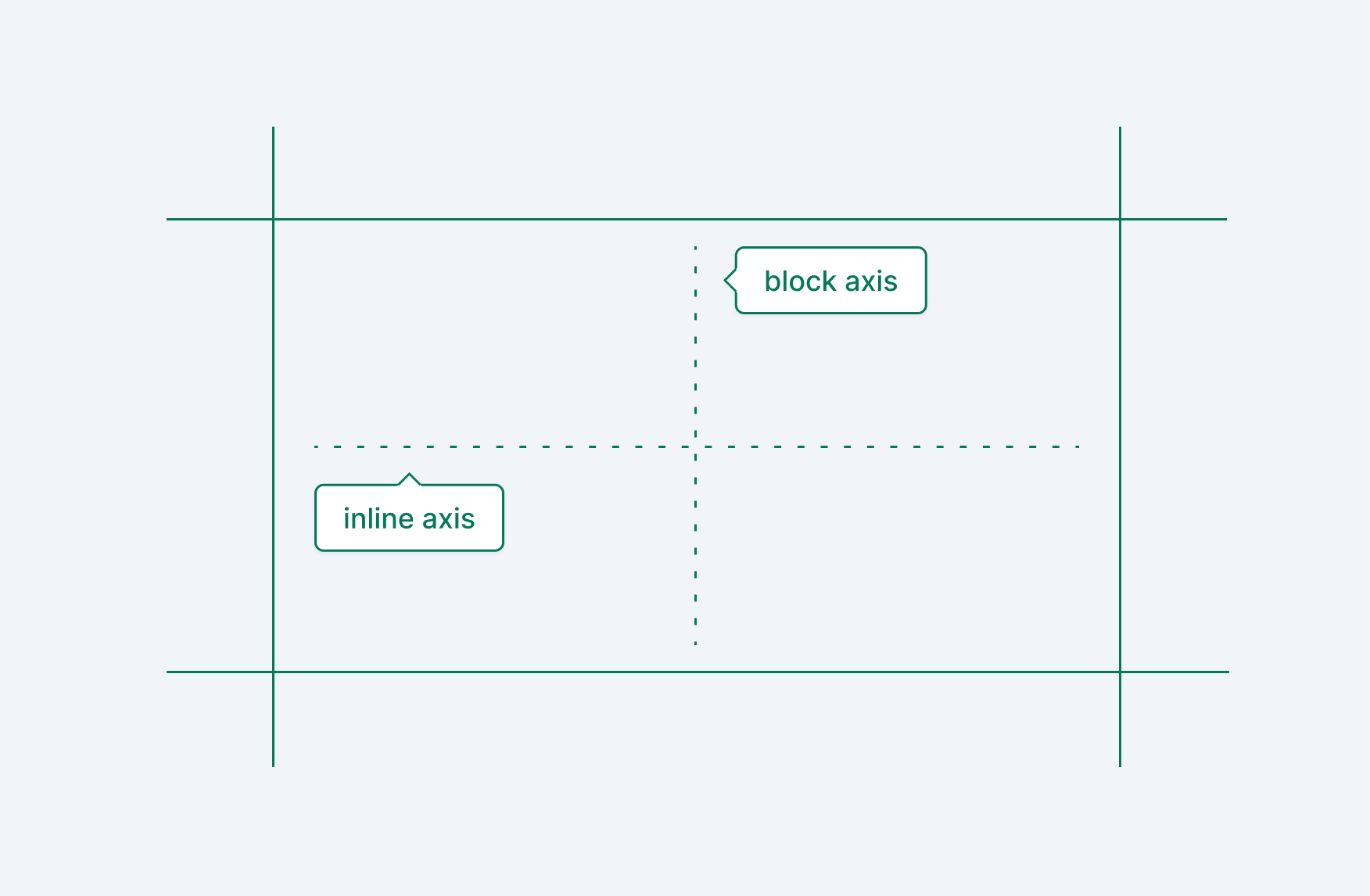
Changing the writing direction will augment these values, but they are relationally tied together. Start and end values can end up mirrored, while the inline and block axis can flip, but will always be opposed to each other.
Box Sizing
Most sites today apply box-sizing: border-box to every element, which calculates padding and border-size values internally. In contrast, the default content-box value adds these values on top of other dimensional settings like width and height.
The primary goal of either box sizing strategy should be that it’s done in a consistent way for all elements. By default,box-sizing: border-box is the **box sizing method for many elements including <table>, <select>, <button>, and <input>, meaning the default content-box value on other elements is forcing you to compute dimensional values in two different ways.
A secondary issue is that content-box makes specific dimension computations unnecessarily difficult. The height and width should be the end values, with padding handling internal layout offsets and margin handling external layout offsets.
Use border-box if possible, it will save you a lot of headaches.
Display modes
Any HTML element can set its external and internal layout via the display CSS property. You’re most likely aware of values like block and inline. These values determine the external layout logic of the element, or how if flows with the rest of the document.10 Consider a <span> which by default has an inline external layout. This setting makes the span slot in with other inline elements if there is room on the inline axis. But changing the span’s display value to block will force it to its own line.
The display property also includes internal layout values, including flex and grid, which both control how descendants are laid out. Internal values can also affect how external values on descendants are applied. If you apply display: flex to the <body> element, setting display: inline on a direct descendant won’t make that element operate with the expected inline layout logic.
External and internal layout values can be combined when applying to the display property. You’ve most likely seen inline-block, but there’s also inline-flex and inline-grid. These values state that the external layout logic should act as an “inline” element, but the internal logic should be block, flex, or grid. The display property can also accept multiple values, which is the newer, preferred way to handle both external and internal values that used to be denoted with a hyphen -. Support for this is just at the tipping point where either strategy is valid depending on your browser support requirements.
Visibility and display
Using display: none and visibility: hidden both hide elements and their descendants from the accessibility tree. The main difference is that visibility: hidden still takes up dimensional space, which can be useful to avoid layout shift and repainting when showing content.
Setting dimensions
Avoid setting static values like height, width, max-height, max-width, min-height, and min-width on components. Most base components should not have opinions about their width or height (including max and min values). A couple of exceptions may be buttons and icons, which usually have small, atomic sizes that shouldn’t change. Dimensional constraints should come from the top down, either via the device itself, container layouts, or a combination of both.
When translating base components from a design comp, test them in multiple container layouts like grids, flexible stacks, and yes static dimensions. The goal of any base component is to be ignored until needed, so it’s important to see what happens when they fit into a space that is too small or too large.
Maximum and minimum values
Use max-height, max-width, min-height, and min-width to set upper and lower constraints on an element’s dimensions. When using both constraints, the minimum value will be used over the maximum value if its larger:
Intrinsic dimensions
There are lesser known sizing values available in CSS, known as intrinsic keywords. They are max-content, min-content, and fit-content. The values can be used with width and height(including their min/max counterparts), grid-template-columns and grid-template-rows.
The max-content value represents the maximum theoretical size based on the property and content.11 Think of a line a text: the maximum theoretical width is the width when the text doesn’t have to wrap to a new line. Be careful with max-content as it will cause elements to break out of their containing box.
The min-content value represents the minimum theoretical size without distorting the content.12 For a line of text, this would be the largest width of a single word. Note that this doesn’t mean one word per line; if two subsequent words are smaller in width than the largest word, they will sit on the same line.
Finally, fit-content will use a combination of min-content and max-content, filling up to the container if necessary, but stopping beforehand if the content is smaller than the container.13
Spacing
The padding property affects the interior layout of an element. In contrast, the margin property affects the exterior spacing around an element. An alternative to margin is the gap property which (in combination with a flex or grid layout) controls the spacing between items.
When designing interfaces, be careful where and when you apply padding and margin as values can quickly compound and cause visual misalignments:
- Think of spacing as a top down setting, ideally applied to container elements and missing from descendants entirely:
- Instead of setting margins on a bunch of cards, add a
flexorgridlayout to the container and usegap. - In the card, define necessary card
paddingon the container and not via descendant elements. - Use
marginandgapto space elements within a component (with a preference forgap). When usingmarginto control spacing, do it from one direction (usually the top or left).
Note: The gap property can not be less than 0, so using margin may be required in those situations.
Aspect Ratios
In the past, a mix of percentage based padding, absolute positioning, and nested divs were required to constrain sizing based on a ratio. Now you can use the aspect-ratio property.
Ratios are formatted as [width] / [height], where the height is inferred as 1 if the / [height] value is omitted.
The aspect-ratio property can also include an auto value, which is useful when you want to start with a placeholder ratio for an item with unknown size (usually an image). How this works is:
- the explicit ratio size (for example
16 / 9) will be used until the item is loaded - once loaded, the item’s calculated dimensions will be used.
img {
    aspect-ratio: 2 / 1;
}

img {
    aspect-ratio: 2; /* this is the same as the above "2 / 1" */
}

img {
    aspect-ratio: 2 / 1 auto; /* once the image loads, its intrinsic ratio will be used instead of "2 /1" */
}
Width and height constraints
Be aware that aspect-ratio can be ignored when used in combination with other layout constraints. If you define both an explicit width and height, your aspect ratio value will not be used. However, if you define either the width or height (but not both), the ratio will be calculated from that value:
| constraint | outcome |
|---|---|
| explicit width, implicit height | ratio is calculated from the width |
| explicit height, implicit width | ratio is calculated from the height |
| implicit width and height | ratio will not be calculated |
Max and min values
Just like width and height, applying max-width, max-height, min-width, and min-height to an element with a defined aspect ratio will override the ratio once it hits the maximum or minimum constraint. This can be very useful when sizing elements whose dimensions are based on a percentage or viewport units.
Flex constraints
In addition, flex-box constraints can also override aspect-ratio values if alignment values aren’t explicitly defined:
| constraint | outcome |
|---|---|
| row direction, default alignment, and explicit width | height is calculated from the largest direct descendant |
| row direction, start, center, or end alignment, and explicit width | ratio is calculated from the width |
| row direction, start, center or end alignment, and implicit width | ratio will not be calculated |
Note: the scenarios above apply to flex-direction: column as well, just replace width with height above.
Positioning elements
In addition to margin, elements can shift their position by setting the position property in combination with top, bottom, left, right, and inset. The inset property will apply to all sides, and can also include two-four values for each edge, just like margin and padding
Relative and absolute positioning
Using position: relative will move the element relative to its current position, but without affecting other items around it. In contrast, using position: absolute will move the element relative to the nearest parent that has applied position: relative to itself. Depending on the DOM structure, this may be the window itself.
Relative and absolute positioning are rife with problems, because you are changing an element in isolation from the rest of the DOM (with the exception of scrolling and initial offset calculations), and while the animation use cases are immediately clear, all of that can be accomplished in a much more performant way with the transform property.
However, one clear use case for absolute may be “hiding” an element without actually removing it from the DOM fully.
Fixed vs sticky
Applying position: fixed to an element will always position it relative to the window, regardless of any parent’s position: relative value. It also ignores scroll positioning. Fixed positioning has been popular forever to create persistent elements like modals and sticky headers. Speaking of sticky, this is a much better solution for something like a persistent header.
Using position: sticky makes an element act like it’s fixed once it hits the top of the viewport. The element’s dimensions are also calculated as part of the normal DOM, eliminating the need to calculate offset padding for other items.
One thing to look out for with position: sticky is that sticky elements are scoped to the closest element with the overflow property applied.14 This makes sense since the idea is they “stick” when they get to a certain position in the viewport, but it can trip you up especially when using overflow: hidden to visually control some other part of the UI.
Static
position: static is the default value of the position property and ignores the top, bottom, left, right, and inset values. It also ignores any applied z-index value.
Stacking elements
Use the z-index property to control the z-axis of elements on screen. In order for z-index to have any affect, one of the following needs to be true:
- the element has a
positionvalue set, excludingstatic - the element is a direct descendant of a flex or grid container
An important concept with stacking elements in the DOM is that they are scoped to the nearest ancestor that includes a valid position property (again, excluding static), meaning that they can’t be positioned higher or lower than that ancestor’s position. Confusingly, the “descendant of a flex or grid container” condition doesn’t conform to this rule, so be very careful applying z-index in those containers (one way to avoid this to apply position: relative to the flex or grid container if you plan to change its direct descendant’s stacking order).
A z-index value can be zero, any negative number, or any positive number. This has caused a years-long issue where new code or third party embeds will set values like 9999999999 to ensure they are at the top of the stack. Please avoid this if at all possible. Here is how I recommend tackling z-index values to avoid headaches.
Avoid defining it at all
Elements have a natural stacking order (with the last element being on top). Try aligning your element order with the natural stack before applying z-index.
Tie stacking values to specific UI contexts
- For document level elements, apply
z-indexusing values like10,20,30, etc. - For localized values in a parent stack context, use
1,2,3, etc. - For temporary, blocking content such as dialogs, use a reserved value like
100
Eliminate unnecessary declarations
For two items in a stacking context, only apply a z-index value (greater than 0) to the one on top. For example, if you are making a sticky header that covers the main content:
header {
    position: sticky;
    top: 0;
    z-index: 10;
}

main {
    position: relative;	/* create a local stacking context within main */
}
It may seem odd to apply position: relative to the <main> element, but it will prevent stacking bugs with z-index values declared on descendant elements.
In addition, if you have a stylist element in a component, meant to go behind the rest of the content, create a local stacking context and use z-index: -1 on just the style element:
.hero {
    position: relative;
}

.hero--background-overlay {
    background-color: rgb(0 0 0 / .2);
    inset: 0;
    position: absolute;
    z-index: -1;
}

/* no need to apply position or z-index on other child elements now */
.hero--title,
.hero--description,
.hero--button-container {
}
Decouple blocking UI
One of the nastiest stacking issues involves displaying a blocking dialog (such as a modal), which is declared in a local stack context. Avoid this altogether by using JavaScript to insert this type of content at the very bottom of the DOM when presented, and removing it when dismissed.
Note: there is no limit on the value of z-index defined in the CSS spec, but its believed to be the upper and lower limit of 32-bit integers (-2,147,483,648 and 2,147,483,647 respectively).
Flex layouts
For “flexible” layouts, use display: flex. Flex layouts are generally placed on one axis, but can be allowed to wrap with the flex-wrap property.15 If your concern is more about alignment of items in a row or column, and less about larger space relationships, opt for flex layouts. When converting an element into a flex container, the following default values will be applied:
- direct descendants will flow from the start of the main axis, next to each other. The main axis is determined by the
flex-directionandwriting-modeproperties (which default torowandhorizontal-lrrespectively) making the default main axis the same as the inline axis. - direct descendants will be aligned to the start and end of the cross axis (the axis opposite the main axis). This means they will fill up the available space, computed from either the container’s explicit dimensions or the largest descendant in the container.
How available space is determined
When you add items into a default flex container, there are various values that will determine the width of items:
- the width of the flex container itself
- the implicit or explicit width of items in the container
- any applied gap between items
- explicit flow settings on each item
This last point is where we’ll focus. Any direct descendant of a flex container can apply three properties to control what happens when there is too much or too little space in the container to fit all of the items by default: flex-grow, flex-shrink, and flex-basis.
The flex-basis property can be used to control the base size of an element before applying additional calculations to grow or shrink elements to fit a flex container. By default, the value is auto, which uses either an explicit main axis value, or the implicit dimensions of the element. You can also apply a value of content to always use implicit dimensions, an explicit length value, or 0:
flex-basis: auto;
flex-basis: content;
flex-basis: 0;
flex-basis: 2rem;
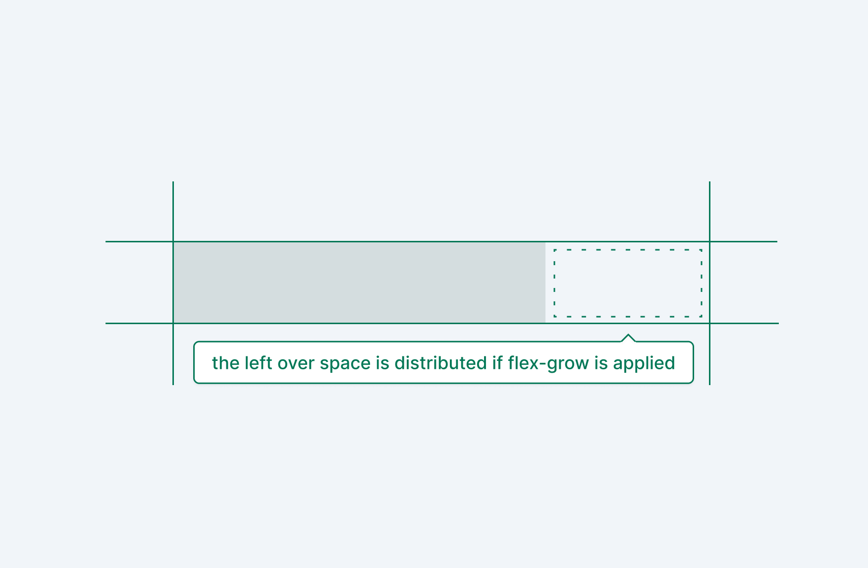
The flex-grow property determines how any leftover space in the flex container is distributed to each direct descendant. The value of flex-grow is any positive number, including decimals, and defaults to 0.16 The value is a ratio, compared to other flex-grow values applied to sibling elements.
Importantly, that does not mean that three items with flex-grow: 1 will all be 1/3rd of the container; instead each element will have an equal amount of the available space applied to their default size. You can use flex-basis: 0 to achieve this17, but if equally spaced values for all descendants is your goal, use a grid layout.
Finally, the flex-shrink property is used when a flex container becomes too small to hold the items as configured with explicit dimensions, etc. It works in a similar way to flex-grow but with some slight differences to avoid shrinking items too much by default. Basically, items have a minimum size of min-content so as containers become smaller, elements with more generous room will decrease faster to keep everything nice and contained without hiding items.18
All three of these properties can be combined into one property called flex which is formatted as:
flex: /* [flex-grow] [flex-shrink] [flex-basis] */
Pushing items
When flex containers aren’t set to have their descendants fill the entire container, you can push elements away from each other using either the margin property or by including an empty element with flex: 1 1 auto. Adding empty elements for styling decisions like this should be avoided when possible. Just make sure to use the logical property margin value if you need to support multiple languages and writing modes (logical properties are covered later in the article).
Grid layouts
Use display: grid to create two dimensional layouts on the block and inline axes. Grid layouts come with many of their own specialty properties and values, including fractional units, the minmax() function, auto flow hints, and more.
Explicit tracks
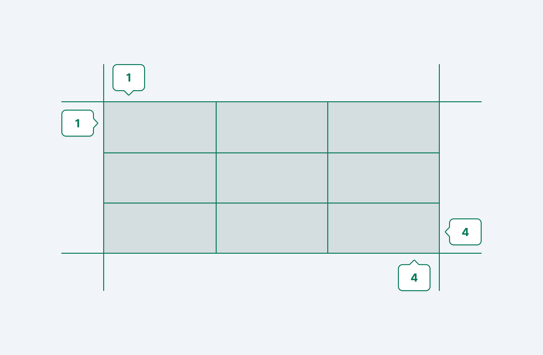
When creating an explicit grid layout, use the grid-template-rows and grid-template-columns properties, which create tracks between the lines of a grid. If we drew four vertical lines and four horizontal lines, intersecting to create a box, we would have three column tracks and three row tracks.
Tracks can accept a variety of values, which we go over below. They can also be named by adding [name] (including the brackets) right before the value:
.container {
    grid-template-columns: [column-name-1] 1fr [column-name-2] 1fr;
    grid-template-rows: [row-name-1] 6rem [row-name-2] 1fr;
}
Any string, other than the reserved words span and auto, can be used for naming tracks.
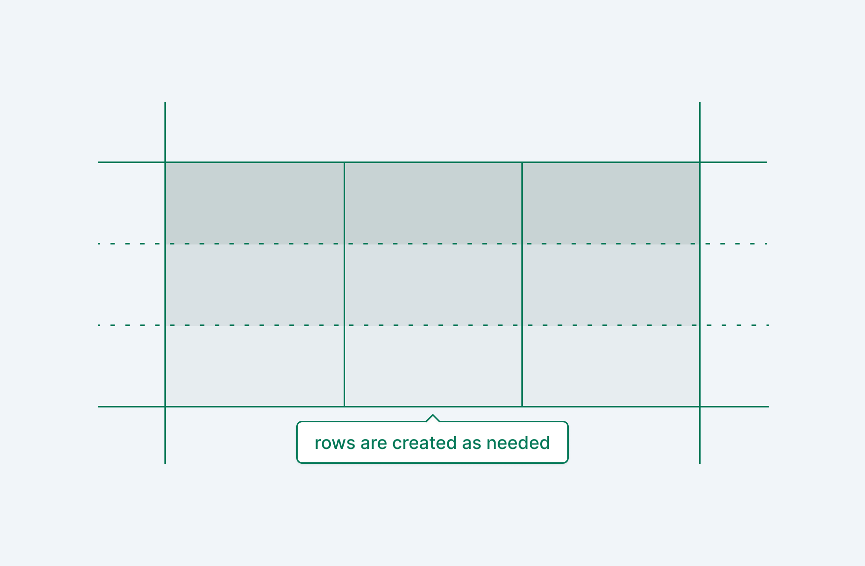
Implicit tracks
While explicit tracks are straight forward, if you have too many items to fit into the bounds of a grid, implicit tracks are created. By default grid content flows on the block axis into “rows”. You can change this by using grid-auto-flow: column to flow items into implicit columns on the inline axis instead.
There are also properties for defining implicit track dimensions more concretely, while avoiding the need to predict how many rows or columns you’ll need for variable content. The grid-auto-rows and grid-auto-columns properties accept one or multiple track values, which can be an explicit size or a responsive unit (more on that below).
Flexible units
Grid layouts setup with tracks that use inflexible units won’t work well in responsive layouts. Yet, the point of a grid is to organize and align layouts on the block and inline axes. Percent units can be used, but are based on the size of the grid container and won’t be accurate when adding gap values (odd decimal values can also occur when setting up a grid with something like 12 tracks 100 / 12 = 8.333333....% ).
These issues are all solved by the fractional unit fr. When using fr, values are calculated relationally to other fr units, as well as inflexible units. That means you can have very flexible layouts including:
grid-template-columns: 1fr 1fr 1fr; /* 3, 1/3 rows */
grid-template-columns: 2fr 1fr 8rem; /* 2/3 of remaining space, 1/3 or remaining space, 8rem explicitly */
Track values can also be set to min-content, max-content, and auto to set the track size based on the content of every item in that track. These values aren’t very useful on their own since you can get unexpected results (especially with max-content), but they really shine with the use of the minmax() CSS function:
.element {
    grid-template-columns: minmax(min-content, 1fr) 1fr 1fr;
    grid-auto-rows: minmax(8rem, auto);
}
Repeating tracks
For quickly repeating tracks, use the repeat() function. This function acts as a track value itself, with the output value replacing its position in the list. At its core, the function takes a number indicating the number of repeats, and the value:
/* These two values are the same */
grid-template-columns: 1fr repeat(2, 4rem) 1fr;
grid-template-columns: 1fr 4rem 4rem 1fr;
You can also pass in multiple values as the second argument:
/* These two values are the same */
grid-template-rows: repeat(3, 1rem 2rem 3rem);
grid-template-rows: 1rem 2rem 3rem 1rem 2rem 3rem 1rem 2rem 3rem
Spanning tracks
Once you have your grid setup, elements can be configured to span multiple tracks. This is possible with four grid specific CSS properties: grid-row-start, grid-row-end, grid-column-start, grid-column-end. Each of these properties takes a starting line number or span [number] where [number] is the number of tracks to fill. Note that the starting line number is not the track itself. For example, a three column grid has four lines, which complete a box:
To make an element fill all three columns, you can do:
.element {
    grid-column-start: 1;
    grid-column-end: 4;
}
You can also use the shorthand properties grid-row and grid-column by adding a slash / between the starting and ending value. Using the span [value] option here can be useful to avoid referring to invisible grid lines:
/* these are equivalent */
grid-column: 1 / 4;
grid-column: 1 / span 3;
You can even shorthand the shorthand properties with grid-area:
/* [row-start] / [column-start] / [row-end] / [column-end] */
grid-area: 1 / 1 / 2 / 4;
Naming grids
The previous section went over how to precisely layout elements in a grid, which can be useful in a pinch, but is generally discouraged. As stated multiple times in this article, layouts should be abstracted up the tree as much as possible, with parent containers dictating dimensions and flow for their descendants. While grids can require a little more finessing than other layout decisions, named grid areas is a great way to avoid applying too many details on descendant elements.
Naming your grid areas starts with the grid-template-areas property. Areas are defined with unique names in a string, based on the columns and rows you have defined. Let’s say you’re making a page layout with six equal columns, a header, body, and a footer. To create named areas you would setup your tracks, along with the grid-template-areas property:
.container {
    grid-template-columns: repeat(6, 1fr);
    grid-template-rows: 6rem 1fr auto;
    /**
     * place the names for each row and
     * column, using the same name for each
     * area's assigned grids and columns
     */
    grid-template-areas:
        "header header header header header header"
        "body body body body body body"
        "footer footer footer footer footer footer";
}
Now, the grid container’s descendants can reference the areas by name:
.header {
    grid-area: header;
}
What’s great about this is that you can change your overall layout without updating the descendants:
.container {
    grid-template-columns: repeat(6, 1fr);
    grid-template-rows: 6rem 1fr 6rem;
    /* we now have a sidebar area as well */
    grid-template-area:
        "header header header header header header"
        "sidebar sidebar body body body body"
        "footer footer footer footer footer footer";
}

.sidebar {
    grid-area: sidebar;
}

/* no need to update the header, body, or footer elements! */
If you want to create empty spaces within your defined areas, use the placeholder period . character. You can also use another custom name and not apply it to any descendants, but if the intention is for it not to be used at all, the standard is using .
Implicit grid names
Grid area names generate -start and -end values implicitly (unless a matching name was explicitly added). Using the example below, this means you can set a value to header-start and header-end for both rows and columns. In addition, the grid-row-start , grid-row-end, grid-column-start, and grid-column-end properties will apply these implicit values implicitly as well, so you can do:
.container {
    grid-template-columns: repeat(4, 1fr);
    grid-template-rows: 6rem 1fr 6rem;
    grid-template-area:
        "header header header header"
        "body body body sidebar"
        "footer footer footer footer";
}

.descendant {
    grid-column-start: header; /* header-column-start */
    grid-row-start: header; /* header-row-start */
    grid-column-end: body; /* body-column-end */
    grid-row-end: body; /* body-row-end */
}
Viewport units
Viewport units are a powerful way to control the size of elements based on the width and height of the browser. This is dependent on the size the actor has set their browser, which is extremely variable on desktop devices and normally full screen on mobile devices.
Default units
The vh and vw units are the default viewport units for height (vh) and width (vw). They are calculated as a percentage of the viewport, so 100vh is 100% of the viewport height. How they differ from percentage units depends on the context:
- percentage units (ie:
50%) are based on the immediate parent’s dimensions - applying
height: 100%does not work unless using grid or flex layouts vhandvwvalues can be used interchangeably for both width and height
Dynamic units
One problem with vh and vw is when a browser has contextual UI that goes away under certain circumstances (ex: Mobile Safari’s bottom toolbar minifies on scroll). Enter dynamic viewport units: dvh and dvw, which can be used to ensure items are sized accurately based on the current browser viewport size. Dynamic units can solve long standing problems with dimensions being calculated either too small or too large due to dynamic browser UI.
Just be aware that item dimensions will recalculate when the browser UI changes in a way that changes the viewport height.
Small and Large units
For more explicit control with dynamic browser UI, use svh, svw, lvh, and lvw units (where s means small, and l means large). Use of these values is extremely dependent on your current problem, but one immediate example I can think of for these units is calculating a hero image for a page. Let’s say you have a design that outlines a hero image which is always 70% of the viewport height. This is to ensure a nice magazine layout, while also showing the start of some text to indicate there’s more content if you scroll.
Using vh units might have unintended side effects with dynamic browser UI and appear too large, hiding the start of the text you want to always be visible. In addition, dvh doesn’t feel right because scrolling increases the image size, which is distracting and unnecessary. Finally, we know this hero image sits at the top of the page, when the dynamic browser UI is largest.
This is a perfect use case for svh units! In addition, because it’s based on the smallest viewport, it still works as intended if the dynamic browser UI, for whatever reason, shrinks on scroll. I have a hard time believing this would happen for most experiences, but its important to not assume the setup of every actor that interacts with your UI.
Responsive queries
Layout values can respond to the overall browser context in multiple ways. We’ve already covered most of it via flex and grid layouts, avoiding setting static dimensions, using aspect ratio for intrinsic sizing, and applying viewport units. All of these options and strategies ensure your elements try to respond to changes in browser width and height. However, sometimes you need to define constraints on specific size values.
Min and max
CSS provides two functions that allow you to enter a list of comma separated values and pick either the smallest value using min() or the largest value using max(). What’s really interesting about these functions is that you can add as many values as you want, and whatever value equals the smallest or largest will be used. In addition, you can combine and nest these functions to add more logic.
Here’s an example that clamps a div between 120px and 320px using a combination of min() and max() computations:
div {
  width: min(max(37.5vw, 120px), 320px);
}
Make sure to calculate the vw value from the smallest viewport that should show the 120px size. In this case, that’s 320px but if you wanted to show 120px at a minimum size of 375px it would be 129 / 375 = .32 * 100 = 32vw.
Once you have that, the equation works inside out: max(37.5vw, 120px) says “grab the largest value from this list, either 37.5vw or 120px". This ensures that 120px is used on viewports under320px. Next, min([value], 320px) (where [value] is the max calculation we just went over) says “grab the smallest value from this list, either the max() calculation, or 320px if the viewport has gotten too large.
An easier way to format this example is with CSS variables:
div {
  --smallest-size: max(37.5vw, 120px);
  --largest-size: 320px;
  width: min(var(--smallest-size), var(--largest-size));
}
Note: There is another function called minmax() that sets upper and lower constraints, but this is only available to control columns and rows in a grid layout.
Clamp
While the above example shows the power of combining and mixing min() and max(), use the obvious over clever solution with the clamp() CSS function:
div {
  width: clamp(120px, 37.5vw, 320px);
}
The clamp() function actually resolves to a nested max() and min() declaration19:
/* the following declarations are the same */
.with-min-max {
    width: max(120px, min(37.5vw, 320px));
}

.with-clamp {
  width: clamp(120px, 37.5vw, 320px);
}
Media queries
Media queries check values from the browser context itself. This means targeting a minimum width and height will apply to the entire browser, not the component you are applying these values to. This may be more obvious in vanilla CSS where a media query wraps selectors, but in extensions like SASS and libraries like css-in-js, it’s common to add media queries inside of CSS declarations, which are scoped to the relevant selector.
If you are using media queries, build up instead of tearing down. This makes responsive layouts easier for a couple of reasons:
- Small layouts, as a rule, are almost always simpler. Remember, this article is about layout only, which on small devices is generally one column.
- What is laid out on a small device will work on a large device. This doesn’t mean a small layout will look great on desktop, but it will at least function. It’s easier (and in my opinion, more pleasant) to work on progressive enhancements for larger and larger screen sizes, rather than spending your time fixing visual bugs because a desktop layout doesn’t work at all on a phone.
Additionally, let go of the notion that your interface will be pixel perfect at every pixel. Instead, pick a few common, relatively evenly spaced sizes and ensure things look great there. Importantly, this isn’t an argument for shipping broken UI at some sizes, but a reminder that things will not look 1:1 with static designs at every unique size.
Container queries
Media query values for properties like width and height come from the overall browser, not isolated sections you define. This makes media queries less useful when targeting layout details for base components that may be shown in a variety of contexts. Container queries are a newer feature that can be used for this exact purpose.20
Other than being based on a container and not the entire viewport, they work in a similar manner to media queries. Ensure your container queries strategy is similar to other spacing and sizing recommendations in this article. That means avoiding baking constraints into your base components and apply layout logic in a top down manner.
Logical properties
In this article, we’ve referred to many common dimensional properties such as:
- height
- width
- margin
- padding
- top
- left
- right
- bottom
While these values are easy to understand in left-to-right-top-to-bottom layouts, they don’t translate well to other language reading directions. To fix this, CSS now supports a new feature called “logical properties” which map to existing properties like margin and padding.
The difference is that, instead of defining top, bottom, left, and right, you use names like -inline-start and -block-end, with inline and block changing axes depending on the writing direction and start and end changing depending on the writing direction. In English, the block direction is vertical, the inline direction is horizontal, the start position is on the left and the end position is on the right.21
That is the only difference. Everything works exactly as you expect in English, but with logical properties you will also get international benefits without creating manual styles for different writing modes. The following table translates common, existing properties and their equivalent logical property (based on the English language’s writing direction):
| existing property | logical equivalent |
|---|---|
| height | block-size |
| width | inline-size |
| max-height | max-block-size |
| max-width | max-inline-size |
| min-height | min-block-size |
| min-width | min-inline-size |
| margin-left | margin-inline-start |
| margin-right | margin-inline-end |
| margin-top | margin-block-start |
| margin-bottom | margin-block-end |
| padding-left | padding-inline-start |
| padding-right | padding-inline-end |
| padding-top | padding-block-start |
| padding-bottom | padding-block-end |
| inset-left | inset-inline-start |
| inset-right | inset-inline-end |
| inset-top | inset-block-start |
| inset-bottom | inset-block-end |
| border-left | border-inline-start |
| border-right | border-inline-end |
| border-top | border-block-start |
| border-bottom | border-block-end |
| border-top-left-radius | border-start-start-radius |
| border-top-right-radius | border-start-end-radius |
| border-bottom-right-radius | border-end-end-radius |
| border-bottom-left-radius | border-end-start-radius |
You can find the full list of logical properties on MDN.
Note: if you use shorthand properties for padding, margin, and inset, you’ll already get the benefits of logical properties without changing anything!
References
- https://developer.mozilla.org/en-US/docs/Web/HTML/Content_categories#flow_content
- https://developer.mozilla.org/en-US/docs/Web/HTML/Element/main#usage_notes
- https://developer.mozilla.org/en-US/docs/Web/HTML/Element/section
- https://developer.mozilla.org/en-US/docs/Web/HTML/Element/header#usage_notes
- https://developer.mozilla.org/en-US/docs/Web/HTML/Element/Heading_Elements#labeling_section_content
- https://developer.mozilla.org/en-US/docs/Web/HTML/Element/article
- https://developer.mozilla.org/en-US/docs/Web/Accessibility/ARIA/Roles/feed_role
- https://html.spec.whatwg.org/multipage/sections.html#the-aside-element
- https://developer.mozilla.org/en-US/docs/Web/HTML/Element/div#usage_notes
- https://developer.mozilla.org/en-US/docs/Web/CSS/display#outside
- https://developer.mozilla.org/en-US/docs/Web/CSS/max-content
- https://developer.mozilla.org/en-US/docs/Web/CSS/min-content
- https://developer.mozilla.org/en-US/docs/Web/CSS/fit-content
- https://developer.mozilla.org/en-US/docs/Web/CSS/position#values
- https://developer.mozilla.org/en-US/docs/Web/CSS/flex-wrap
- https://developer.mozilla.org/en-US/docs/Web/CSS/flex-grow
- https://developer.mozilla.org/en-US/docs/Web/CSS/CSS_flexible_box_layout/Controlling_ratios_of_flex_items_along_the_main_axis#combining_flex-grow_and_flex-basis
- https://developer.mozilla.org/en-US/docs/Web/CSS/CSS_flexible_box_layout/Controlling_ratios_of_flex_items_along_the_main_axis#combining_flex-shrink_and_flex-basis
- https://developer.mozilla.org/en-US/docs/Web/CSS/clamp#return_value
- https://developer.mozilla.org/en-US/docs/Web/CSS/CSS_container_queries
- https://developer.mozilla.org/en-US/docs/Web/CSS/CSS_logical_properties_and_values#block_vs._inline